# importing required libraries
import pandas as pd
import seaborn as sns
from matplotlib import pyplot as plt
url = "https://raw.githubusercontent.com/pic16b-ucla/24W/main/datasets/palmer_penguins.csv"
penguins = pd.read_csv(url)
# shortening the label for the species column
penguins["Species"] = penguins["Species"].str.split().str.get(0)Setting Up
To make any plot, we first need to import all the libraries we will need later. Here, we import Pandas for data processing and Matplotlib and Seaborn for the actual plotting. Given the URL of the dataset, we use Pandas to read and save it as a Pandas dataframe, and we can shorten the species label for convenient viewing using Pandas string operations.
Data Processing
The raw dataset is not very helpful for our plotting purposes, so we create a new data frame through the use of the Pandas groupby function. We group by island ans species, and insert a new column containing the size of each of the groups. This is what we will eventually plot.
# grouping the penugins in the data set by species and island
# represent that count in a new column called Number
df = penguins.groupby(['Island', 'Species']).size().reset_index(name='Number')
Creating the Figure
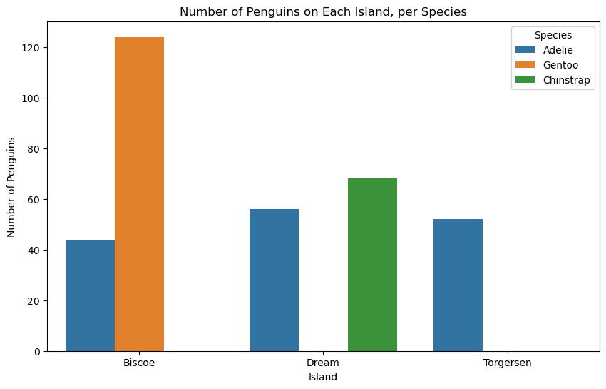
We will use a combination of Matplotlib and Seaborn capabilities to create a barplot displaying how many penguins of each species are located on each island. We use Matplotlib to create a figure, and then use Seaborn to create a barplot. Our data set will be our Data Frame called df from the previous section, the x-axis will be the island and the y-axis will be the number of penguins. The hue parameter ensures that the plot is separated by species. Finally, we use some Matplotlib tools to set our legend, title, and change the y-axis label to something more descriptive of our plot.
# create a figure
plt.figure(figsize=(10, 6))
# using seaborn, construct a barplot of number of penguins per island, separated by species
sns.barplot(
    data=df,
    x="Island",
    y="Number",
    hue="Species",
)
# update legend, title, and more descriptive y-axis label
plt.legend(title="Species", loc="upper right")
plt.title("Number of Penguins on Each Island, per Species")
plt.ylabel("Number of Penguins")
Text(0, 0.5, 'Number of Penguins')